The SAM Initiative
Website Redesign, UI Design
About The Project
As a Designer for Develop for Good, I was matched with our client, The SAM Initiative, to redesign their website. The SAM Initiative is a non-profit organization that serves as a catalyst to improve the lives of woman, children and families in Los Angeles through engaged philanthropy and grants.
This redesign aims to modernize the aesthetic of the website, revamp information architecture, and reduce the non-profit’s administrative workload through new web features.
🎯 30+ Years Old, Non-Profit Stakeholders
The Problem
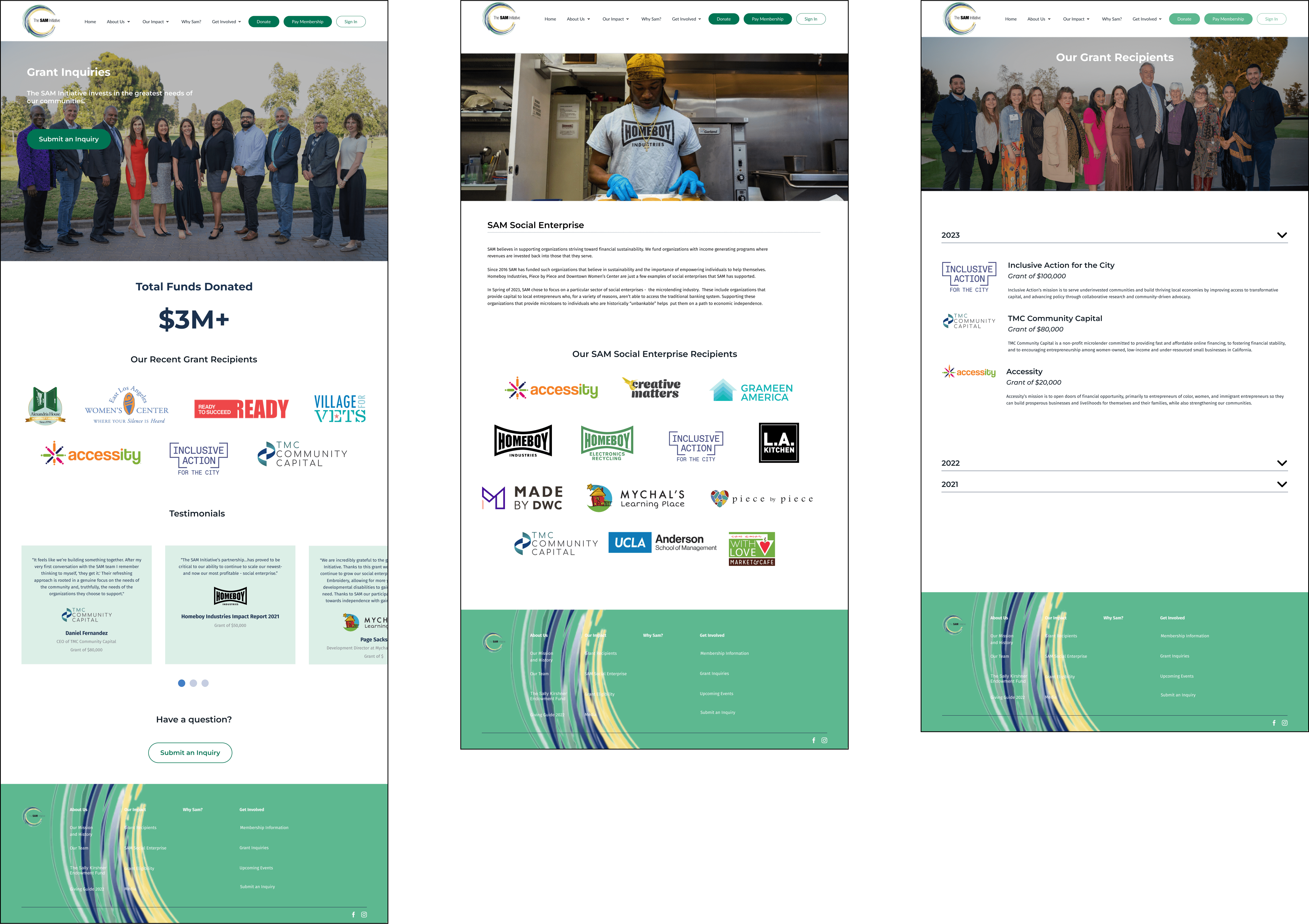
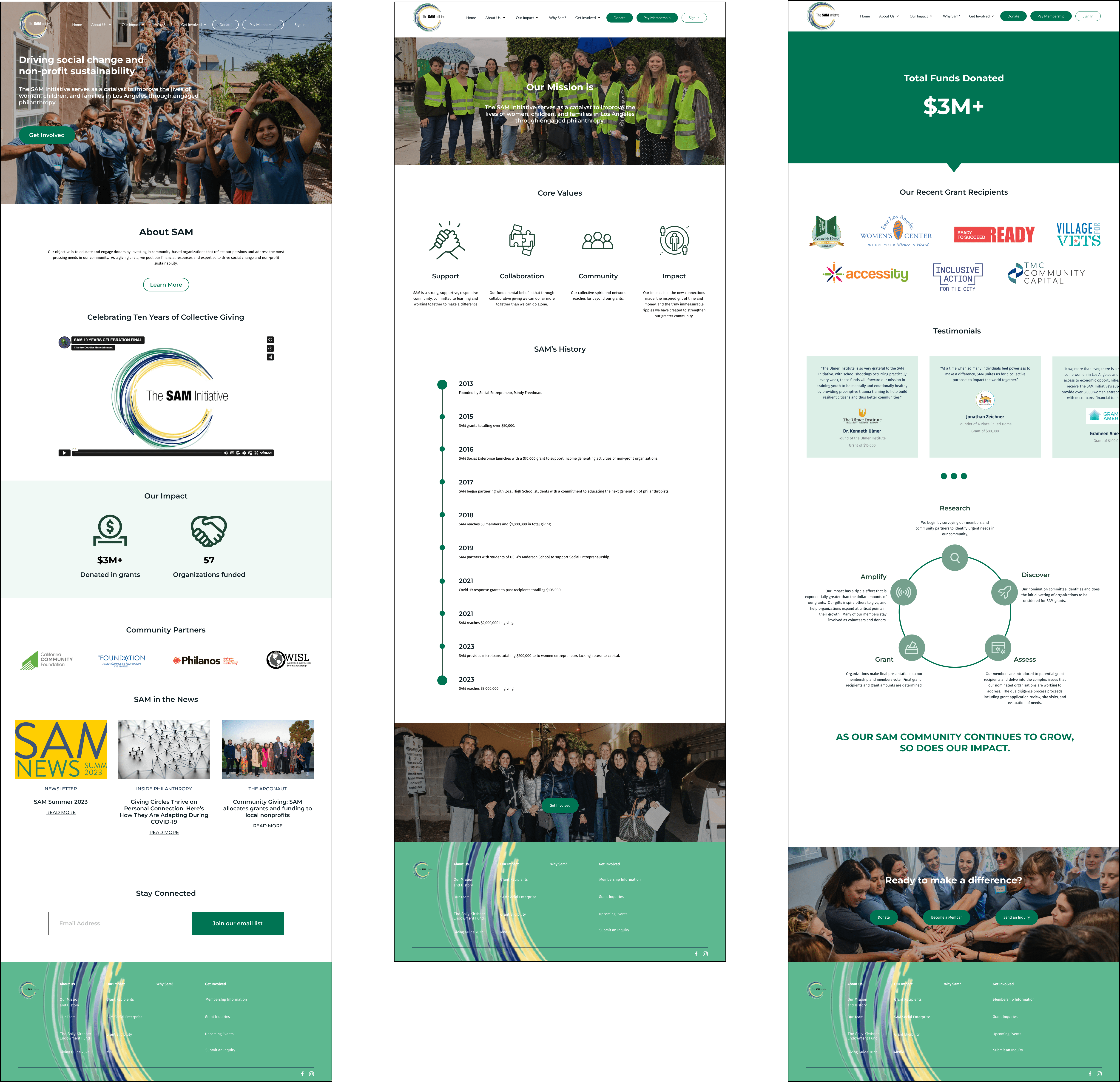
The SAM Initiative’s initial website was outdated in terms of aesthetic, pushing them to fall behind competing non-profits who have established a trustworthy image through their modernized and functional website. Alongside, the navigation to find information around the website was difficult; information was not eye-catching and hard to miss, overloaded with texts, or hidden amongst vague navigations and headers. Moreover, it lacked essential documents and information necessary for distribution to grant applicants and potential members, increasing workload for the SAM leadership team.
The Solution
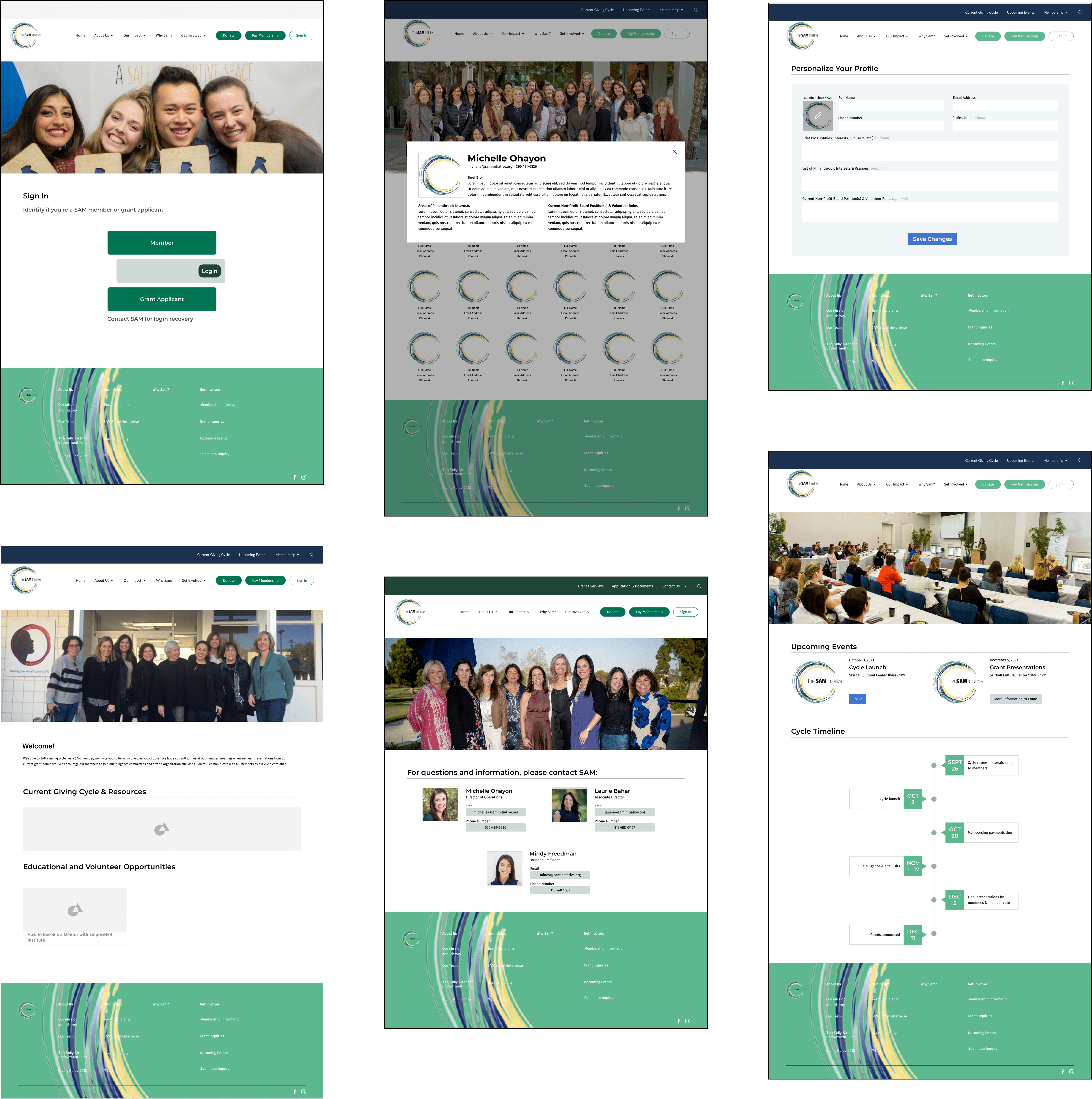
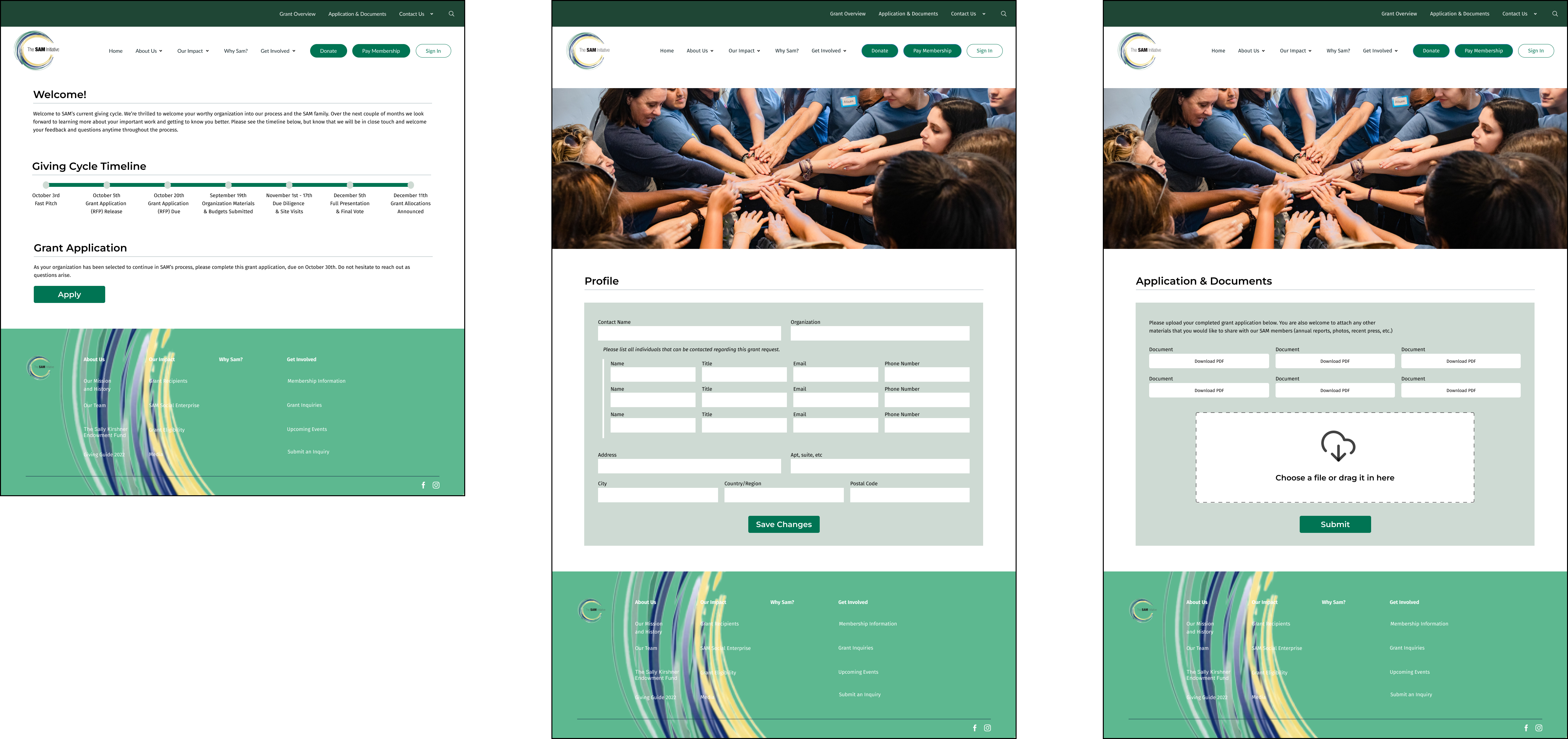
The goal is to research direct and indirect competitors to understand current design trends and gain inspiration on modernizing the website with new graphic features, simplistic designs, and uniformity of designs. Alongside this, this new redesign will include a membership portal and grant applicant portal to organize information for differing users and user flows, as well as reduce administrative workload for the SAM leadership.
Design Process
1. Discover 🔎
Project Scoping with Client, Competitor Analysis
2. Define 🔑
User Personas, User Journeys, Objectives/KPI + Measurement
3. Ideate 💡
Initial Ideas, Information Architecture, User Flow
4. Design 🎨
Style Guide, Low-Fidelity & High-Fidelity Wireframes
5. Implement 🖥️
CMS Research, CMS Implementation
6. Recollect ⭐️
Challenges, What I Learnt, What can be Improved
Project Scoping with Client
Our client initially came to us hoping to redesign their website for a refreshing new online presence that will encourage more engagement with the website and the non-profit. While discussing the non-profit’s mission statement, achievements, and works, alongside the client stakeholder’s day to day use of online web platforms, we recognized that we could reduce their administrative workload through this redesign.

User Personas


Objectives & KPI
After discussing with the client we outlined three objectives, as well as KPI’s and measurements to define how we will navigate the project as researchers and designers.
Objective 1: Landing Page
⭐️ Create a visually engaging and informative landing page that encourages website visitors to access and utilize the platform
KPI: Achieve a 40% member login rate and encourage utilization through the landing page
Measurement: Monitor the percentage of members who log in and use the website after visiting the landing page
Objective 2: Member Portal
⭐️ Increase member engagement by ensuring easy access and utilization of the website
KPI : Achieve a 40% member login rate and utilization of member-specific features
Measurement: Monitor percent of SAM members who log-in and utilize the portal
Objective 3: Grant Portal
⭐️ Enhance website's usability for grant applicants and reduce administrative workload
KPI: Ensure 100% of grant applicants use the website for accessing materials and submitting applications
Measurement: Ensure 100% of grant applicants use the website for accessing materials and submitting applications
Information Architecture
Many successful non-profits create compelling, interactive and credible experiences by providing evidence of their work and avenues to engage with them. Evidence includes statistics, news updates, and media, which builds trust and therefore support. These websites are often action and story-oriented, with many CTAs distributed across content. In addition, non-profits with memberships have their own member portal and exclusive content, which encourage repeat interaction and enduring interest.

User Flow

Style Guide

💫 Reflection
This was my first all-student team project, and I'm very happy with the new knowledge and experience I was able to gain from my fellow peers and mentors at Develop for Good!
Here are a couple things I learned and would change:
⭐️ Compromise and advocate for our design solutions.
Working closely with our clients, we were constantly chatting with stakeholders because we wanted to ensure they understood our UX process. However, this led us to receiving countless requests that conflicted with what we determined would be the most effective for users through our research. I learned that although these decisions were ultimately in the hands of the stakeholders, it was our responsibility as designers to advocate for our designs through extensive research and evidence, and find innovative solutions to come to a compromise.
⭐️ Communication and individual responsibility is key in a team.
When we initially started this project, there was strong team morale, however as we reached the 1-month mark, our design lead became unresponsive. Although this delayed our project a couple weeks, each designer worked extra hours to get our project back on track and one of our designers and I stepped up to be the new lead. We created a new comprehensive timeline to get the project completed on time and presented it to the client alongside reassurance that the quality of our work will be kept high even with our tighter scheduling. Unexpected challenges are bound to occur in teams, however communicating and taking responsibility allows us to adapt and overcome them.


.svg)


.png)