Showcasing the trusted expertise of IRS-Certified volunteers will be a strong focus of the new website. This free service helps strengthen credibility and provides a sense of high quality and high value service.
Eight-in-ten Americans (82%) say they consult online ratings and reviews when buying or using something for the first time. Making it easy for a client to write a review is critical piece of building trust and credibility.
Everyone should be able to enjoy your website regardless of their ability. Especially for a service provided by Orange County United Way whose mission is to serve underserved populations, it is essential that accessibility is regarded highly. According to ADA Title III, every business website has to be accessible to people with disabilities, or it will be at risk of being sued and facing unnecessary legal expenses. We use AccessiBe (an AI and machine learning web accessibility solution) to solve this problem. Based on research, this is the most affordable and simple solution in the market today.
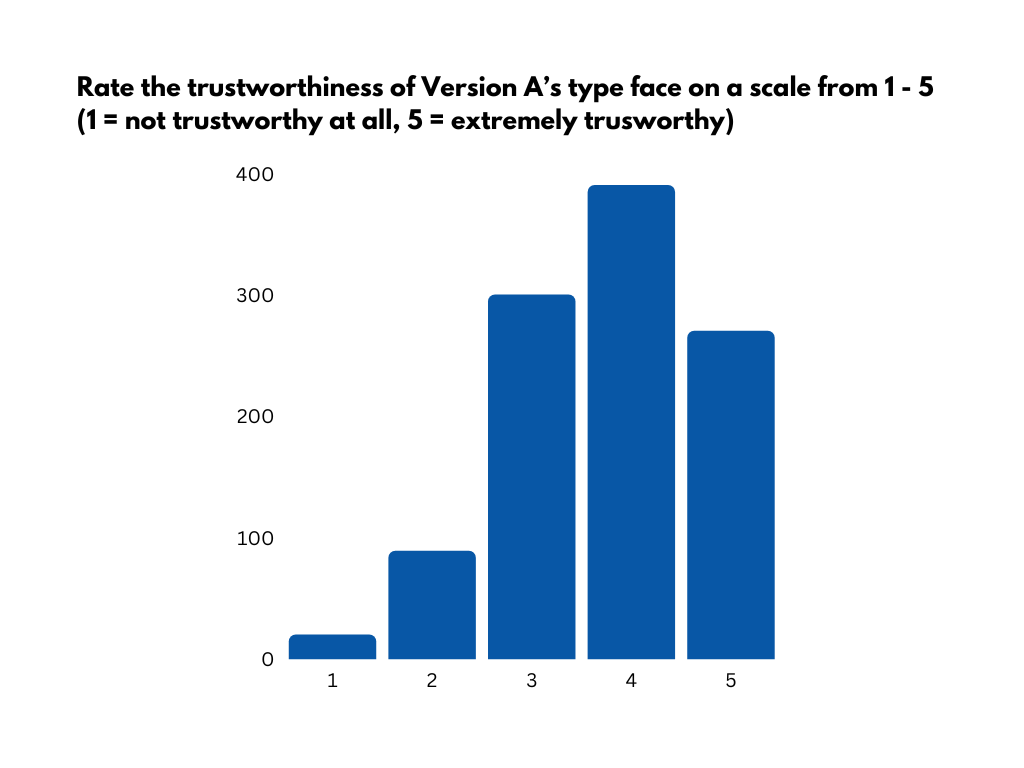
On-site surveys are critical to help enhance the user experience. They appear whenever you need them during the user journey. Capture in-the-moment feedback by launching your surveys the way you like: using a popup or sending them a link. This helps discover how your users feel about their online experience.
Heatmaps visually represent where users click, move, and scroll on your site. Recordings are playbacks of users scrolling, moving, u-turning, and rage clicking on your site. From entry to exit, we can reliably map the user’s full experience. This can help us identify where problems, pain points, and bugs are.