Lunar Trading LLC
Mobile App Design, UX Design
About The Project
As a Product Designer for Lunar Trading, I worked alongside a fellow designer to research leading finance/investing apps and design an app that would guide and educate students who want to begin investing young. Lunar Trading is an app that harnesses the potential of AI and ML to empower young investors and students by providing accessible, simplified, and educational methods for investing.
This apps aims to democratize investing and make financial growth attainable for everyone. With engaging and simple designs, Lunar Trading will help young audiences understand finances and relieve financial distress.
🎯 Undergraduate/Graduate Students, Young Adults
✂️ Figma, Adobe Illustrator
The Problem
As the cost of living continues to increase, emerging adults and young adults struggle to find peace with their finances and savings. However, many young adults do not invest their savings even with the rise of apps that allow them to start investing using their phones.
The Solution
We hypothesize that many young adults do not invest because, with many other stressors such as school, personal life, and jobs, they often forget the power and importance of investing young. Those who do want to invest may be put-off by the intimidating nature of investing their savings.
The goal is to create an easy and trusted app that helps young adults and soon-to-be investors build trust in the idea of investing through education, and guiding them to make financial decisions (through AI/ML) that will support their financial goals. The app will simplify the process, making sure that every step is easy to understanding and not time consuming. This app will focus on attracting young audiences into investing and promote young adults to start investing young.
Competitor Analysis

We focused on comparing the onboarding process, user flow, special features, and overall UI between these top finance/investing apps. Here are some notes:
- UI tend to follow a dark + neon theme = helps users feel more at ease compared to white + corporate themes that feel intimidating.
- Long onboarding process deters users.
- Lack of explanation through every step = pain point. User needs to feel as though they are in autonomy and to help new users feel in control, explanations are necessary.
- More resources + news on current trading best practices and tips would be useful
User Survey & User Interview
To get a clearer understanding of our audience, as well as some of their wariness in investing and finance apps, we used a survey and interviews to gather data and give us a starting point in ideating designs.
User Survey = gauge interest and start understanding target audience
User Interview = learn finance management behaviors of young adults and features we can implement into our map for it
How old are you?
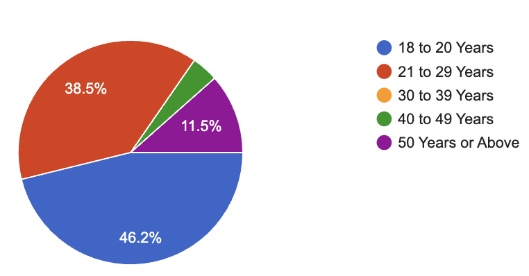
What gender do you identify as?

Are you currently a student? Are you working?

Have you ever invested in stocks?

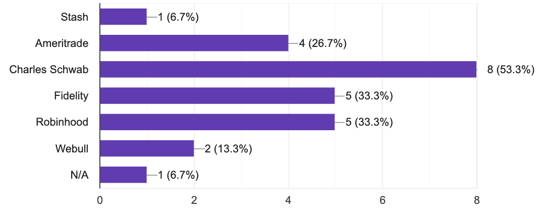
If you have invested before, have you used any of the following apps?
If you have invested before, what factors have influenced your decision to invest?

If you have invested before using an app, did resources provided by the app resolve any questions?

If you have never invested before, does the thought of investing through an app raise security concerns for you?

If you have never invested before, would more guidance and educational resources encourage you to invest?

If you have never invested before, does the thought of investing through an app raise security concerns for you?

Some common themes we noticed: lack of understanding in investing, those who are investing may have had assistance from their parents (hands-on parents), lack of perceived time.
Here are some user interview questions we asked to understand user's behaviors and habits with money and saving:
- How do you manage your finances right now? Do you have a set budget and how do you organize that?
- Do you have any savings? Where do you keep those savings?
- Where do you learn about finances and budgeting?
- Give me a summary of your knowledge in finances, budgeting, and investing.
- How are you currently affording your expenses?
- How would you describe your spending habits to be like? What are some personal rules you have for spending?
- Do you have a Roth IRA set up? Explain what it is to me.
- How hands-on would you say your parents are in your finances? How hands-on have they been previously?
Low-Fidelity Wireframes

For our designs, here are some features we focused on based on the user survey and interview:
- Clear CTA to give easy-to-follow instructions
- Summary of companies + stocks to simplify understanding for users
- Simple onboarding process
- News section of current investing news to keep users up-to-date
- Content design focuses on education and resourcefulness
High-Fidelity Wireframes


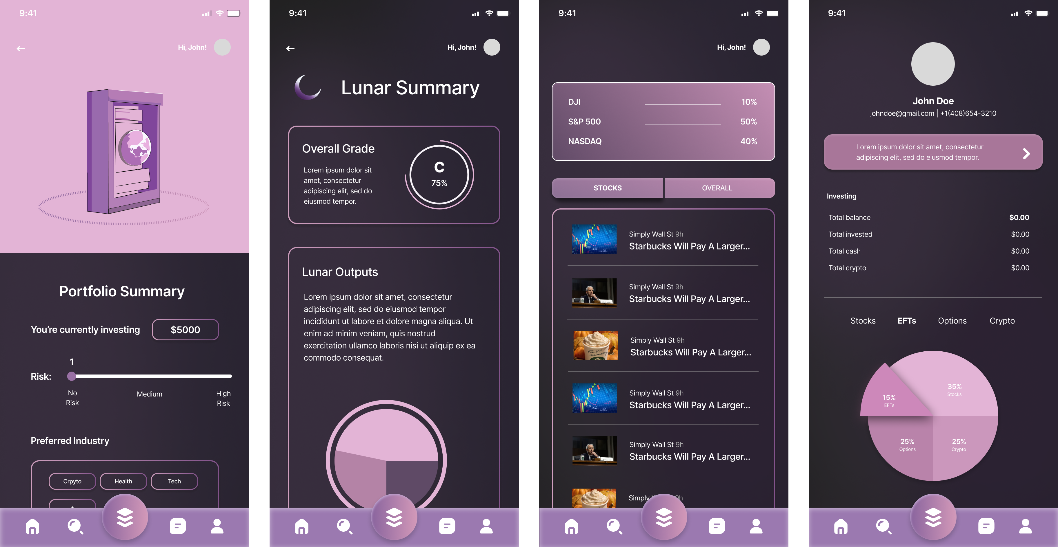
Bringing our low-fidelity wireframes to life, we focused heavily on the notes we took from the competitor analysis. To play into the modern, trendy aesthetic of new, leading investment trading apps, we used a dark theme throughout the website, with a focus of purple that illustrates the app name and logo. The graphic elements of the app, all made on Adobe Illustrator, help to alleviate intimidation, something we recognized in Robinhood. We focused on making the app design clear and simple, with elements of education. The goal was to help users feel a sense of relaxation when they open the app and represent financial responsibility with the deep, rich purple tones.
💫 Reflection
This was my first mobile app design project, and I'm very happy with the new knowledge and experience I was able to gain from my fellow Product Designer and Product Leads at Lunar Trading. Going into this project, I myself, could relate to the pain points as a student who lacked understanding of investment trading. This project offered me a valuable opportunity to learn about investing and create a product that will help fellow peers.
Here are a couple things I learned and would change:
⭐️ Understanding your product is ESSENTIAL.
When creating our survey questions for the user research, I had lacked a deep understanding of investing and finances. This made it extremely difficult to design a research study that would be flawless of biases and provide us with enough information to guide our design decisions. Moving forward with this project, as we work cross-functionally with Frontend and Backend Engineers, I would like to apply the new knowledge I have gained about investing to create a smoother user test and hash out more user pain points.
⭐️ No need to reinvent the wheel.
The initial problem we were trying to solve with this app was regarding the overwhelm and complexity first-time investors face when using investment apps. In the beginning, my fellow designer and I wanted to design an app that would revolutionize investing and approach the designs very differently. However we learned that there is no need for us to change everything but rather build off of existing apps, which is what our competitor analysis helped us understand.